


HILL COUNTRY PEDIATRICS - Project Overview
UX / UI Design / Information Architecture / Usability Testing / Branding
HILL COUNTRY PEDIATRICS provides patient-centered care in a family-friendly setting.
Hill Country Pediatrics was started in 1997 by Dr. Elizabeth Bartlett, who has been recognized as one of Austin’s “Best Doctors” by Austin Monthly three times. We provide patient-centered pediatric care in a warm, family-friendly setting.
They offer plenty of one-on-one time with your child’s doctor to develop mutual trust and long-lasting relationships. During nights and weekends, they offer medical consultation over the phone where you will speak directly to one of their physicians, rather than a nursing triage network.
• Same-day appointments,
• Separate sick and well-waiting areas,
• Ease of scheduling,
• An on-site lab so you get critical lab results faster.
“Most of our physicians and staff are mothers themselves, so we understand how important it is to build a trusting, long-lasting relationship with your child's physician.”
Tools: Figma, Miro, Whimsical, Photoshop, Illustrator
THE CHALLENGE
Business Challenge: The design is outdated, it was launched more than 15 years ago (www.hillcountrypediatrics.com), not offering a first good impression and not serving the practice with the best intentions of communicating trust and confidence to the patient. The content is not well managed and updated, and it’s not displaying properly on other mobile devices so a fully responsive website design it’s a must.
Users’ Challenge: [BONUS] Add more unique or advanced features, such as booking an online appointment or paying online your outstanding bill.
THE OBJECTIVES
Redesign from scratch the old existing website of a local pediatric medical office with clutter-free and modern content.
Create a new access point in the main nav to the client’s profile.
Develop or extend coherent branding that aligns with the practices' current and/or desired patient experience.
CONSTRAINTS
The Logo must remain similar but open to new treatments and color schemes.
The project must be completed in 80 hours.
Navigation: Homepage / Services / Appointment booking / Staff / Map and directions / Company history or “About Us” / Forms / Insurance / Tips and Resource
DESIGN PROCESS


1. Empathize Heuristic Evaluation > Competitive Analysis > Interviews
2. Define Persona > Business & Users Goals
3. Ideate Site Map (FigJam) > User Flow > Task Flow (Whimsical)
4. Design Sketches > Mild-Fidelity Wireframes (Figma) > Branding/UI Kit/Brand Style Tile > High-Fidelity Design (Figma)
5. Iteration & Implementation High-Fidelity Interactive Prototype (Figma) > Usability Testing > Findings > Revisions
1.
EMPATHIZE
I have studied and evaluated by testing and taking notes about the existing website to determine the re-design goals of the client and the patient's needs. I have decided and applied the following research methods:
Deliverables: Heuristic Evaluation, Competitive Analysis, Users Interviews
HEURISTIC EVALUATION
I went through the existing website, analyzing and evaluating the overall design look and structure of the website, the functionality, and the existing UI components.
Findings:
The website's look and feel are outdated and do not communicate a competitive, trusty service.
Text heavy with no consistency for links, buttons, or typography sizes.
No major CTAs like Make an Appointment, Portal Access, or Contact link.
The navigation has no hierarchy.
No use of white space.
Oversized, cluttered logo, no sense of branding and business identity.
The design is not responsive. It is imperative to have a mobile-friendly site these days.
Visual design issues, outdated or irrelevant information.
The hierarchy of the elements is not logical.
The functions offered by the site do not follow the trends; for example, instead of a Google Maps integration, a separate page is loading with directions provided in text rather visually.
No images related to the practice or icons are present to help the user understand the message visually

COMPETITIVE ANALYSIS
I looked at more than 7 healthcare providers' websites and organized the patterns for each main section of the website (like the homepage header, body and footer, and other key pages). This gave me a solid understanding of the industry and how to identify the interface solutions that are widely used on healthcare websites. I have also evaluated and compared the large organization websites and those that are more medium-sized regional providers like my client's case. I have put together in a doc the strengths and weaknesses of 3 to 5 current or potential competitors.

USER INTERVIEWS / Qualitative Research
1:1 interviews arranged in person or virtually via video calls with the scope of gathering in-depth insights about how the potential users would like to use the website and what kind of information and features they would like to see available.
Objectives:
Understand the parent's expectations regarding their child’s health and also the way they need to use, navigate and access the medical website.
Identifying the pain and frustrations of the targeted users (parents, providers, and the rest of the medical personnel).
Studying and identifying the strengths and weaknesses of the existing local pediatric competitors.
Identify elements and features that are making those existing websites successful.
Participants
Parents of young children and teens
Expectant parents
Current medical personnel
Research Questions
What is the preferred device when accessing the medical website?
How do you/the user evaluate the providers?
What is expected from a medical website?
What kind of information, features, and services you would like to have when using a medical website?
How much do you rely on the information seen on the medical website?
What exactly is conveying trust and reliability to you over the other local medical website providers?
What’s a deciding factor for you to choose or not to a particular medical practice? (in this case, specialized in pediatric care)?
Timeline
Day 1: Competitive Analysis & Recruiting Participants for Interview
Day 2: Prepare the interview script
Day 3: Conduct the interviews
Day 4: Synthesize the research findings
Day 5: Gather and organize in a doc/presentation the conclusion of the research and the plan for the project
Insights:
The majority of the users go to visit the website for a specific task or information.
Self-scheduling is a very nice feature that every parent would like to have access to directly from the website.
Clear content, well-organized, intuitive navigation.
Important info: clinic hours, patient portal log in, Contact/location, Doctor's bio, type of specialties.
2.
DEFINE
Deliverables: Persona, Business & Users Goals
USER PERSONA

DEFINING THE GOALS

3.
IDEATE
Deliverables: Site Map, User Flow, Task Flow
Tools: FigJam, Whimsical
SITE MAP
I created a new sitemap incorporating existing pages and adding new important ones with new features and resources.

USER FLOW
The User Flow was created in Whimsical so we can understand one of the main tasks of the website: requesting an online appointment.

4.
DESIGN
Deliverables: Sketches > Mild-Fidelity Wireframes > Branding/UI Kit/Brand Style Tile > High-Fidelity Design
Tools: Illustrator, Photoshop, Figma
BRANDING
The old logo and color scheme needed to be updated; it was clattered and not print-friendly. I have started by sketching a few options. First, I wanted something resembling the old logo, as established clients have been used to the brand, and when exposed to the new look, they could be confused.

COLORS
The old design uses four colors: blue, yellow, green, and red. I have opted for a palette that is closer to kids’ preferences, with candy shades of green, pink, blue, and yellow. I think this is refreshing, modern, and stands out among the competitors. Also, the logo presents very well for print and black & white option.

SKETCHES
I enjoy a lot producing hand sketching for the main landing page. My goal was to quickly generate as many ideas as possible before choosing the best design to move forward with. Here are the initial sketches I came up with for the HCP’s homepage:
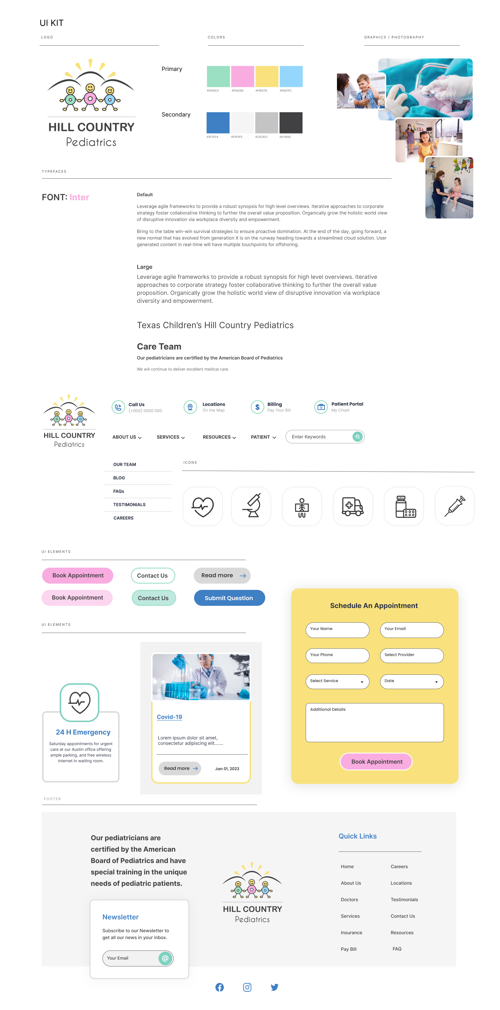
Hill Country Pediatrics did not currently have any sort of "UI Kit", so I created one for them to use for other promo materials.
MID-FIDELITY WIREFRAMES

HIGH-FIDELITY
UI DESIGN - MOBILE

HIGH-FIDELITY UI DESIGN - DESKTOP

5.
Prototype & Test
Deliverables: High-Fidelity Interactive Prototype (Figma) > Usability Testing > Findings > Revisions
Tools: Photoshop, Figma
USABILITY TEST - Test Objectives
Test and observe the overall usability, ease of navigation, and exposure to the information throughout the site.
Test the amount of effort and time taken to complete the main tasks of the website.
To see if it's easy to locate all the necessary and essential information the patients need.
To find out the overall impression of the branding and look and if that affects their ability to fulfill tasks.
The users could easily navigate the prototype and complete the tasks without errors or frustrations.
A high-fidelity prototype was created in Figma and tested on selected users.

TASKS FOR TESTING
Task 1: Book an online appointment after learning about any particular Physician.
Task 2: Explore the website and find/locate necessary information like Book Appointments, Locations, Contact, Hours, Services, News.
Bias: Most of the users are friends & family, so there are chances of inaccurate feedback.
Task Completion Rate: 100%
Errors: None encountered
The average time taken by users to complete the tasks: 2-3 min
Hypothesis: Users open the clinic’s websites only to book an appointment.
Participants: 3 mothers ages: 27 with 7 months baby, 36 with two toddlers, 48 with one teen.

My hypothesis was proven false. Apart from booking online appointments, users also use the clinic’s website to majorly access the patient portal and sometimes to check new services, doctor information & vaccine updates.
SUMMARY OF FINDINGS
User 1 user flow - Home -> About Us -> Our Team -> Doctor Page -> Book Appointment.
User 2 user flow - Home -> Book Appointment CTA
User 3 user flow - Home -> Scroll down to Appointment Section -> Book Appointment
3 out of 3 users finished the task quickly without any errors.
3 out of 3 users could find the locations of the clinics easily.
2 out of 3 users liked the map view within the website.
1 out of 3 users wanted integration of a quick link to google maps for directions.
3 out of 3 users could locate the services and providers list quickly.
1 out of 3 users expected the emergency number to be displayed on the "Call Us" CTA.
1 out of 3 users had a slight delay in finding the clinic hours.
1 out of 3 users expected "available hours" from the online appointment form.
3 out of 3 users found the UI Design very clean and straightforward, having a healthcare feel with soothing colors.
3 out of 3 users found the overall navigation straightforward.
3 out of 3 users did not encounter significant issues or flaws in the user flow or the site's usability.
1 out of 3 users double-checked the testimonials/reviews from the website and went to check from other sources as well. She also preferred to see the “Testimonials” field present on the Provider’s page.
3 out of 3 users Wanted to see the “Reviews” stars displayed next to the Provider’s Profile.
2 out of 3 users did not care about the Blog page.
The same insights apply to the mobile version as well.
REVISIONS & CHANGES (Before & After)

Add ratings, location, and phone number to the Provider's Profile

Add a new CTA displaying the practice’s phone number next to Book Appointment CTA on Locations Page

Add a new CTA displaying the practice’s phone number next to Book Appointment CTA on the Home Page
CONCLUSION
Redesigning and updating an existing website was a challenging task. In this process, I learned how to analyze an outdated design, identify priorities, and define new business and design goals based on current user needs but also consider other features that could be beneficial and in line with current requirements. As a result, the redesign enhances the user experience and benefits the practice by attracting new clients and maintaining established clients by keeping their trust.