

MIRROR - Project Overview
UX / UI Design & Branding
MIRROR is a clothing store targeting exclusively a female audience looking for affordable yet fashionable clothing for all ages. The business started in 1994 as a clothing store targeting an audience looking for cheap clothing for any occasion, along with the wave that brought us Old Navy and H&M.
The quality is pretty good, and the prices are relatively low. Their main idea is to make any type of clothing accessible to everyone. They believe clothing doesn’t have to be expensive and last forever, that we should be able to change styles as we need and please.
“Clothing doesn’t have to be expensive
- we should be able to change styles as we need and please.”
Tools: Figma, Miro, Whimsical, Photoshop, Illustrator
THE CHALLENGE
Business Challenge: A very outdated brand and information website. They need to catch up with other similar businesses in having an online presence, increasing sales, and clearing their warehouse inventory.
Users’ Challenge: To shop from the comfort of their homes and have the overall best online shopping experience by being able to select the right merchandise, and applying the right filters embedded within the website’s functionality.
“Clothing doesn’t have to be expensive and last forever
- that we should be able to change styles as we need and please.”
THE OBJECTIVES
Design a responsive e-commerce website that is easy to use and allows customers to have an easy and positive experience when shopping and browsing through all products using various filters.
Create a new brand identity by designing a new logo for the company that is modern and neutral enough to attract all types of customers.
THE RESULT
MIRROR will be able to reach and attract new customers
Increase its revenue by addressing the needs of the company and current and potential customers.
DESIGN PROCESS


1. Empathize Competitive Analysis > Research Timeline > Interviews
2. Define User Persona > Empathy Map > Storyboard > Project Goals > Feature Map > Card Sorting > Site Map
3. Ideate User Flow > Task Flow > Sketches > Low Fidelity Wireframes
4. UI Design Brand Style Tile > Responsive UI Design > UI Kit
5. Iteration & Implementation Usability Test > Affinity Map > Priority Revisions > Final Prototype
1
EMPATHIZE
The targeted research allowed me to deepen my understanding of what the company offers and how to design to meet users’ needs in an already established apparel market. The conclusion was simple: “consumer desires have not changed; they still want shopping to be stress-free, convenient, personalized, and of good value”, however, features like a video of products, and customer reviews are a must for a modern online shopping platform.
Deliverables: Competitive Analysis Doc., Research Timeline, Interview Prep
COMPETITIVE Analysis
I started with basic competitive analysis & market research for a better understanding of the current retail market and to identify possible solutions and opportunities by assessing the strengths and weaknesses of 3 to 5 current and potential competitors.

Research Methods
To be able to define the company’s goals, it was important to create a timeline and the different methodologies I would use.

RESEARCH Timeline

INTERVIEWS / Participants
I proceeded with the 1:1 user interviews to understand the user's problems, determine patterns, and to be able to empathize with their needs and expectations. I conducted 4 interviews with all females between 15 and 55 years old who shop for clothes frequently online. I asked them questions related to their shopping experiences and wishes.
•Adults 18+, young professionals, moms, or seniors from different environments who shopped before online at H&M, Old Navy, or similar
•Frequent online/in-store buyers
•Used with online shopping
RISKS:
1. Participants may give brief or vague answers.
2. Have already biased opinions from previous online shopping

Though it seems counterintuitive, having too many customer personas can dilute your messaging.
The insights gathered from the user interviews, empathy mapping, and road mapping all concluded that the users /consumers love friction-free, easy-to-use, shopping platforms.
2
DEFINE
During this phase, the main objective was to synthesize the findings of my research and
define who I will create the website for.
Deliverables: User Persona, Empathy Map, Storyboard, Project Goals, Feature Map, Card Sorting, and Site Map.
PERSONA / Empathy Maps
Based on the collective qualitative insights gathered from the interviews, I created the following persona that would further narrow down the specific goals and needs to help me define the problems. Defining the target persona aims to get a share of attention from high-value visitors, attract relevant leads, and facilitate their conversion and retention process. This will help us provide a proxy for the user during design, gain empathy with our users, and create a cohesive, empathetic view. It is the buyer personas that help businesses decide:
•Where to guide product development;
•What kinds of content to create;
•How to follow up on leads;
•How to deal with some matters related to customer acquisition and retention.


Consumers are motivated to shop online because of the convenience, of the ability to search, filter, and compare. They want to shop efficiently and navigate without frustration.
An intuitive UI is important to have a stress-free experience.
The consumer’s in-store experience can significantly influence the online experience and vice versa.
The computer is preferred when shopping online - big screen, better resolution, multiple windows can be open to compare and read reviews.
Most interviewees had a strong sense of brand loyalty in terms of frequenting the same site and committed to the quality and consistency of brands they already know.
Returns were mentioned to be a service differentiator when deciding where to shop.
Almost everybody mentioned that they are looking to read reviews, ideally with pictures to help them decide what to purchase.
Less is more - more products don’t necessarily attract customers so apparel companies must reduce assortment.
It was frequently mentioned that in-person shopping is preferred; most of the interviewers have recently switched to online shopping, mainly because it is more convenient and more accessible to search and narrow for specifics.
Live retail therapy is desired – real-time, interactive video streams that sell products, on social platforms.
Almost all the people interviewed, emphasized the price as being one of the most important factors plus fit and quality.
Sales and discounts were very important being a decisive factor in finalizing the purchase. “Buy-now” purchase plans coming sooner than later, and Fee-free “buy now, pay later” (BNPL) payment plans were very appealing to everyone.
When prompted to sign up for a membership or create an account, most people opted to bypass or abort the shopping altogether.
PROJECT Goals
After defining the core problems from the user's side, it was time for me to go back and see the big picture by visually organizing the project's primary goals into this Venn diagram.

FEATURE Roadmap
Once the goals were clearly defined, I created a list of product features as well as their priorities in terms of development in the product design. Based on the priorities of the business and user's needs, the list is organized by: Must-have (P1), Nice-to-Have (P2), Surprising and Delightful (P3), and Can-come-later (P4) features.


3
IDEATE
Deliverables: User Flow, Task Flow, Sketches, Low Fidelity Wireframes
Tools: Maze, Miro, Whimsical
CARD Sorting
Classifying the website information, and establishing the categories for merchandise.

SITE MAP
Task Flow / User Flow
After setting up the project goals and organizing the content of MIRROR through card sorting, I went ahead to build up the structure of the website using the sitemap. This will help me plan the site before even start creating it. It's a lot easier to build and design once you've created a structural layout.


SKETCHES
Three options are presented for the Home Page

4
PROTOTYPE & DESIGN
Deliverables: Branding, Style Tile, UI Kit, Responsive UI Design
Tools: Illustrator, Photoshop, Figma
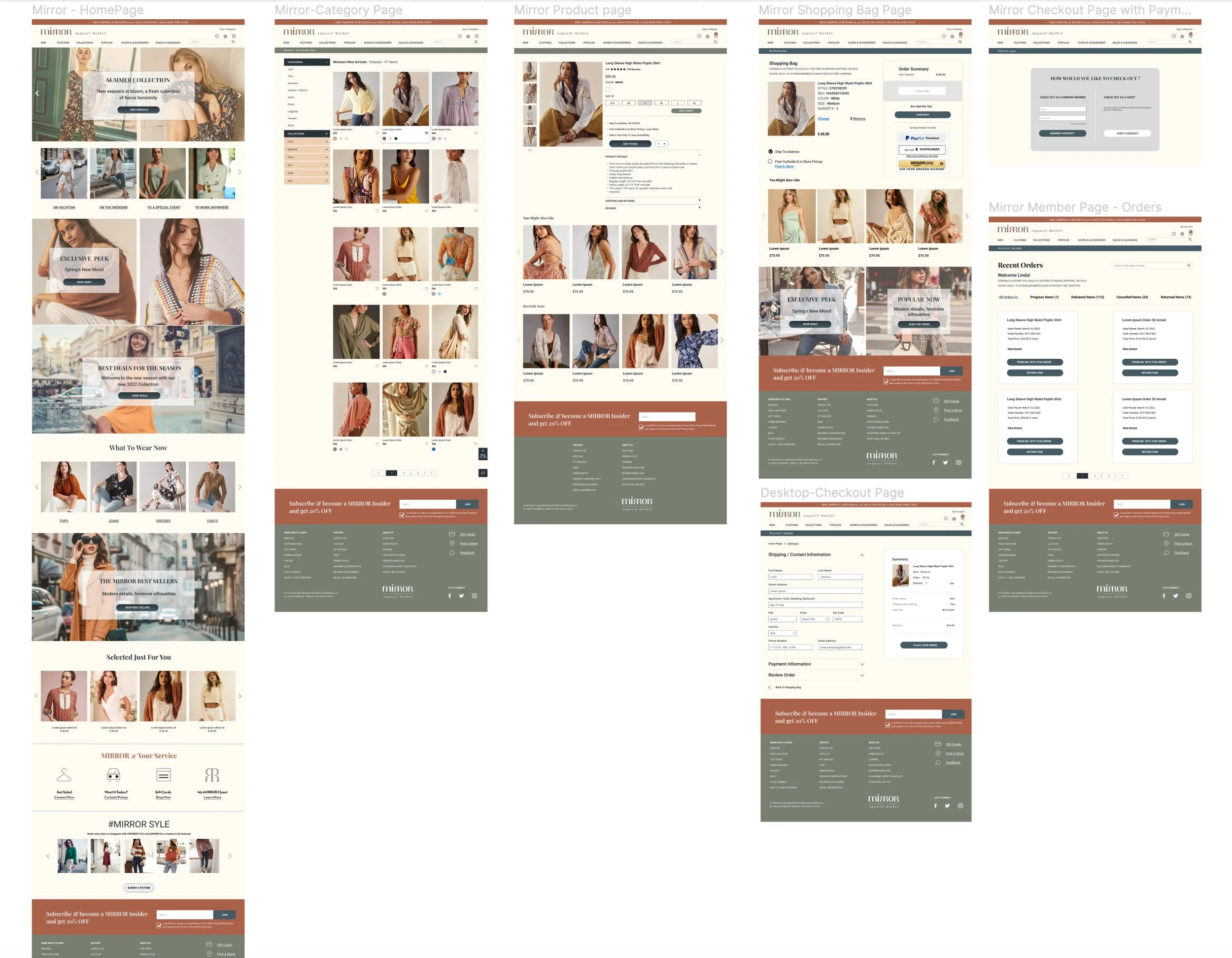
RESPONSIVE Wireframes
TABLET / MOBILE / DESKTOP
Based on the user flow and the kind of tasks that a user would like to perform,
we are creating the mid-fidelity responsive wireframes. Solving the challenges of a responsive design is a challenging task
to do.
UX is key: responsive design needs more than converting a desktop site into a mobile screen. We need to consider the user's experience, their interaction with the device, and the content they're looking for while using a mobile device or desktop.
There are no major differences between the designs, the layout stays the same with few adjustments, size, and proportions of elements. All three are designed using an 8px grid with 12 columns for desktop, 6 for tablet, and 3 for mobile. The categories and main menu of the nav are reduced to the Hamburger menu and the search and shopping bag is preserved and visible.

BRANDING & UI Kit

VISUAL DESIGN / High-Fidelity Wireframes
5
ITERATION & IMPLEMENTATION
Deliverables: Usability Test, Affinity Map (Miro), Priority Revisions, Final Prototype (Figma)
Tools: Photoshop, Figma, Miro
FUNCTIONAL PROTOTYPE - Testing
After I finalized the high-fidelity wireframes, I created a prototype based on the user flow and the tasks a user would like to perform. To achieve this, I had to consider the user's experience, their interaction with the device, and the content they want to access or task to perform. Figma was the perfect tool for designing this functional prototype which helped me to convert the desktop version to a mobile one.

AFFINITY Map (Miro)
(based on the results collected from the testing of the prototype)
It was easy and not so easy to test this prototype, due to the limited design and unavailable fields. Some hypotheses were confirmed, and some improvements resulted from the testing but no patterns or major pain points wore identified yet, based on this initial testing. Additional testing could be beneficial.

PRIORITY Revisions
I have made some changes and improvements to the design based on a few elements that appeared problematic after my testing, ex: drop down from the main menu, quick preview, magnification option.

CONCLUSION
My biggest takeaway is planning well and allowing enough time to generate user research and flow mapping. These are essential to the integrity of the product (app or site). Also, understanding users' needs, human behavior, and tendencies, using universal UI graphics and layouts, and implementing them well with current technologies and best practices. All the above play significant roles in the success of a great UX/UI design.